ShopDreamUp AI ArtDreamUp
Deviation Actions


Description
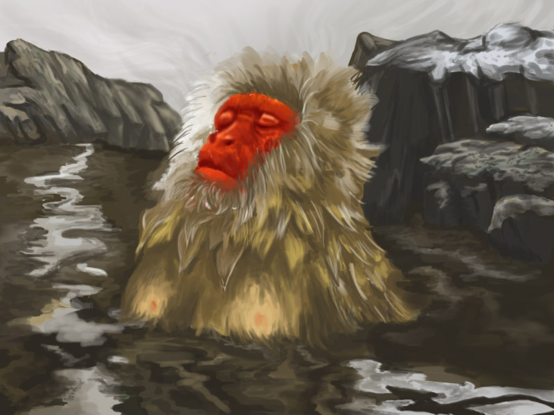
Digital painting practice, reference was from a TIME photo that I couldn't find online? Most likely from this photo series.
Please critique! This is one of my first few serious attempts at digital painting and I'm sure there's a lot of room for improvement~
Please critique! This is one of my first few serious attempts at digital painting and I'm sure there's a lot of room for improvement~
Image size
800x600px 121.55 KB
© 2014 - 2024 Newpapers
Comments8
Join the community to add your comment. Already a deviant? Log In
I've been here! Oh man one of the best couple of days of my life.
But sorry, I am here to give you feedback!
This is a really nice picture, obviously it looks really realistic and it has a kind of flow to the strokes which kind of feels relaxing like a hotspring. I really like it.
I just say the comment below mine also said to tone down the red, I am going to be more specific make it less orange and take down the saturation a bit. Another comment is that the other colours are too similar. So you have this really jumpy red and these two browns that are almost identical. If you have a few more subtle shifts in hue to introduce a bit of variation in the brown that would make it more interesting and it might balance out the red if you wanted to keep it vibrant.
I can't quite work out the background, if those strokes are supposed to be there or you were correcting a mistake around the edge, but it looks ok it just follows the edge of the rocks a bit much and kind of looks like a mistake you could easily fix that, but I will be the first to admit this is a pretty subjective opinion of mine.
Well I hope this helps! It looks good for a first attempt at digital painting, I find digital painting really hard so I was pretty impressed. Such a great photo too (I think there is art to choosing subject matter as well)